A Pantone intézet minden évben megválasztja az év színét, amely szerintük a legjobban illeszkedik majd az előttünk álló, új évhez. Az idei, azaz 2022-es év színe a Very Peri nevet kapta, amelyet a vállalat külön legyártatott, ilyen szín eddig nem létezett.
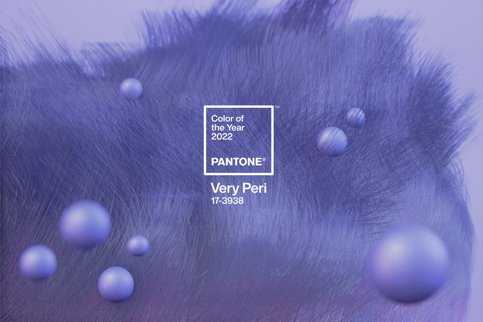
Leatrice Eiseman, executive director of the Pantone Color Institute, said in an interview: “It was really important for us to come up with a new color, because we have a very new vision of the world now. The color symbolizes the future. It has that sprightly, joyous attitude that we’re talking about, that carefree confidence, and creative spirit.”
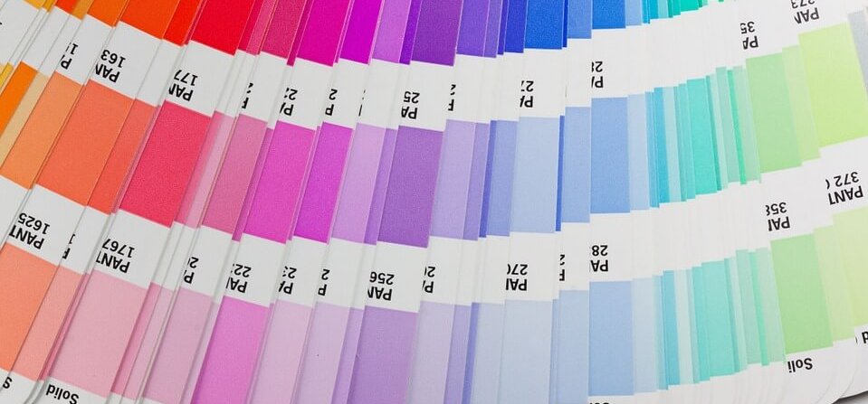
Did you know that the Pantone Institute was originally a paint factory? But over the years it has outgrown itself and is now mostly known for the colors it defined, i.e. the Pantone Color Identification System, which is a color reproduction system patented by the company. In this system, the colors are standardized, so products from different manufacturers can be matched on this basis.
Pantone organizes secret meetings twice a year, where groups from different nations discuss color standards. After two days of presentation and discussion, the next year’s color is chosen. It is also interesting that the results of the meeting are published in Pantone View.
I, personally, tend to like the Pantone Institute’s color choices. Last year’s color, i.e. 2021, was gray and vibrant yellow. It was a very exciting combination, which I also liked. For example, I made this necklace in this color.

However, every year, in addition to the positive zeitgeist and the colors of nature, Pantone also draws inspiration from technological innovations, and in the spirit of this, they are collaborating with Microsoft on the color of the year 2022. Thus, Very Peri will also be available on interfaces such as PowerPoint, Teams, Edge and Windows user interfaces.
So you will discover the colors of this year’s selection not only from me and I hope that you will like them too, since this blue-purple version was your favorite anyway. You bought a lot of blue jewelry last year. True, they were still denim blue and bright navy blue. Well, now we’ll redden it a little.
However, surprisingly, I already had jewelry in a similar shade last year. An interesting heart pendant.

So let’s learn the name of the new color, which has been given the fantasy name Very Peri. Its shade is comparable to periwinkle, which has been used for a long time. I wonder if you will like this color!
0 Comments